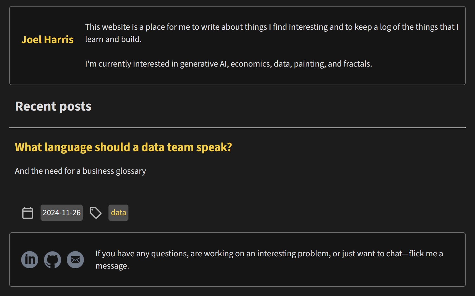
The previous version of this website was my first attempt at hand crafting a website, here it is:

Some might say it looks better than this site—and that may be true—but this new site feels more like me.
People who use the internet often take for granted just how homogenous websites are. Title in the top left, nav items in the top right, a call to action in the middle, social links at the bottom. People aren’t really even cognisant of these design choices, and that’s the point.
Typical website design is made to help us move through the web without having to stop and think, mostly because they’re trying to make money and they want you to get the checkout page as quickly as possible.
Enter the personal website, here we are free to experiment, as this website is purely designed to lose me money (domain names aren’t free, especially ones as good as joelharr.is).
The design of this website is expressly done to make you stop and orient yourself when you first arrive. So, make yourself at home, have a look around—I personally recommend checking out the art.
P.s. if you’re wondering about the .is domain extension, it’s Icelandic. They send me nice emails about once a year.